Case Study
Montecito Plastic Surgery
Dr. Lowenstein
Project Overview
Incredible Marketing helps Dr. Lowenstein and Montecito Plastic Surgery reimagine their patients’ experience using a touch of minimalism.
“My morning…
CERTIFICATIONS
SPECIALTY
LOCATION
CASE PERIOD
Background
Montecito Plastic Surgery is the private practice and surgery center of double board-certified plastic surgeon, Dr. Adam Lowenstein, nestled in the heart of coastal Santa Barbara, California.
As a current member of ASPS and ASAPS, and former member of the board of directors of ASPS, Dr. Lowenstein is best known as both a specialist in aesthetic plastic surgery of the face, body, and breast and in advanced reconstructive surgery. For Dr. Lowenstein, he didn’t feel that his website reflected the sophistication of his practice or his patients. So he came to us to help him reimagine the patient experience and transform his existing website into an infrastructure for new business. With a library of interactive media and a surplus of educational content, the challenge would be to weave a cohesive narrative out of what Dr. Lowenstein had already created. The goal? To open a window into the world of a real patient: Dr. Lowenstein’s patient.
Conservative yet modern. Simple yet sophisticated.
Dr. Lowenstein came to us with an established brand identity already, but it didn’t quite scream sophistication like he had hoped. For him, though the individual elements of his brand- logo, colors, imagery, fonts, and words- had the makings of modern, when they coalesced on his website, the impression was anything but.
To achieve the conservative yet modern, simple yet sophisticated look that Dr. Lowenstein desired, the design didn’t need more; it needed less. Less effort. Subtler imagery. Fewer features. And simpler choices. For the sophisticated, minimalism reigns supreme.
Reimagining the patient’s experience
From bedside manners to the state-of-the-art surgery center, we wanted prospective patients to vicariously experience their journey with Dr. Lowenstein directly from his website. If we could offer patients the information and media necessary to simulate their own experience, not only could we reduce friction and apprehension throughout each phase of their journey, but we could better set expectations, too.
Using Dr. Lowenstein’s preexisting library of multimedia content as a starting point, we went to work architecting the site so that visitors could experience each phase of the patient journey from any page. The result? When empathy meets sophistication, everybody wins.
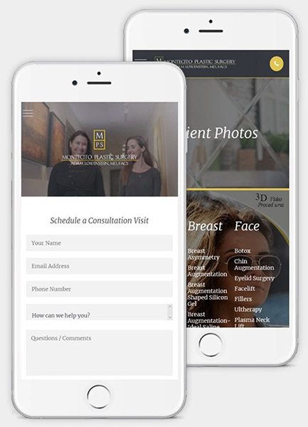
Montecito’s message, in the palm of your hand
Today, you’re either a thumb swipe away or irrelevant. And with a booming audience of mobile-first patients, no matter how well we communicated Dr. Lowenstein’s core message on desktop, if it didn’t translate on mobile and tablet, it didn’t matter. (Not to mention Dr. Lowenstein and his colleagues prefered to use the website on a tablet when speaking with patients.)
To ensure that our focus remained steadfast on creating an experience equally as compelling on mobile as it was on desktop, we adopted a mobile-first design process. This allowed us to engineer the content in a way that complemented the smaller screen and shorter attention span of mobile users first, knowing that if we could make it work on mobile, we could make it work on desktop.
Good design goes unnoticed
Good design goes unnoticed. It’s functional. It’s innovative. It’s intuitive. And it’s more than just colors and images: it’s an experience. For Dr. Lowenstein’s website, a touch of minimalism and a sprinkle of sophistication proved all the difference.
In the end, experience comes down to choices: which choices you offer the visitor and why. Too many choices can lead to mental fatigue, quick. Not enough choices and your visitors will search elsewhere for answers. But the right choices, in the right sequence, at the right time, with the right context can turn an otherwise “brochure” website into an infrastructure for new business. Just ask Dr. Lowenstein.